The Improved Responsive Menu Twenty Twelve
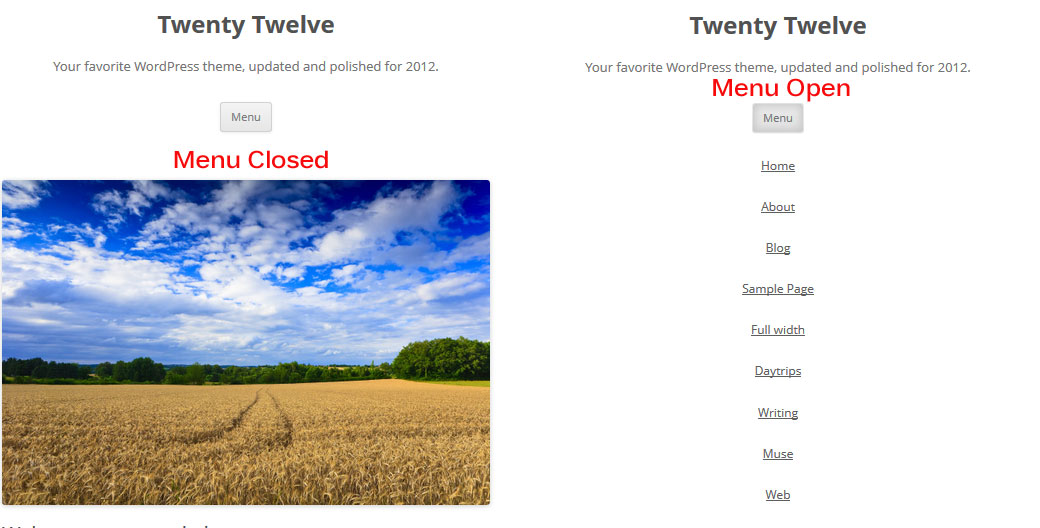
Click To Enlarge
Click To Enlarge
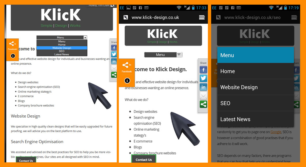
This menu is used on Klick Design test it out first on your device.
I have assumed that you have created a child theme for Twenty Twelve if you have not then read this first.
Right lets start to change the menu, first you need to create a new custom menu.

Click to Enlarge
Navigate in your dashboard to Appearance>Menus and create a new menu.
Name the menu ‘Klick’, add the pages you want to the menu save the menu and select it as your primary menu.
For the next bits you can download the zip at the bottom of this page.
First open the add-to-styles.css file copy the code into the bottom of your child styles.css’
Next create a folder called js in your child theme and upload the klick-nav.min.js to that folder. I have minified the js for you to load nice and fast.
If you ever need to minfy a .js file then I use this tool it is free an just does it in a browser window.
Add the code from the add-to-functions.php into your child functions.php or simply rename the add-to-functions.php to functions.php and upload this to the child theme.
What’s left well it should be working for you now, You have your improved responsive menu twenty twelve so next to style it to match your theme colors.
|
1 2 3 |
.selectnav { display: none; width:50%; } select.selectnav {margin:0 auto; background-color:#464646; color:#ffffff; text-align: center; } |
In the above css you can change the width, background color and color of the text, I am sure some of you will get fancy.


