The Improved Responsive Menu Twenty Twelve
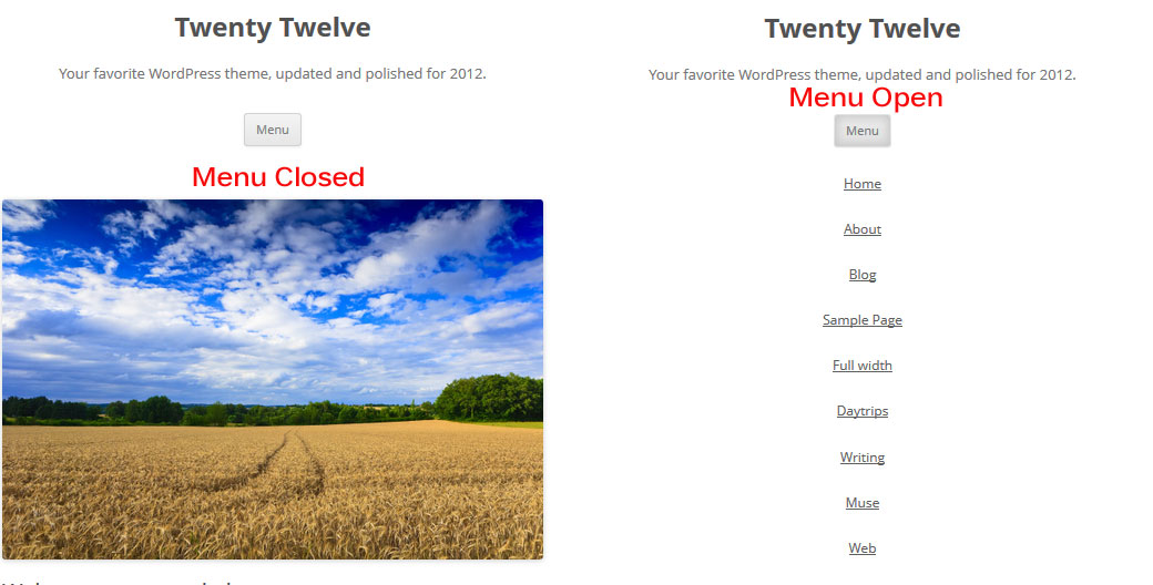
Click To Enlarge
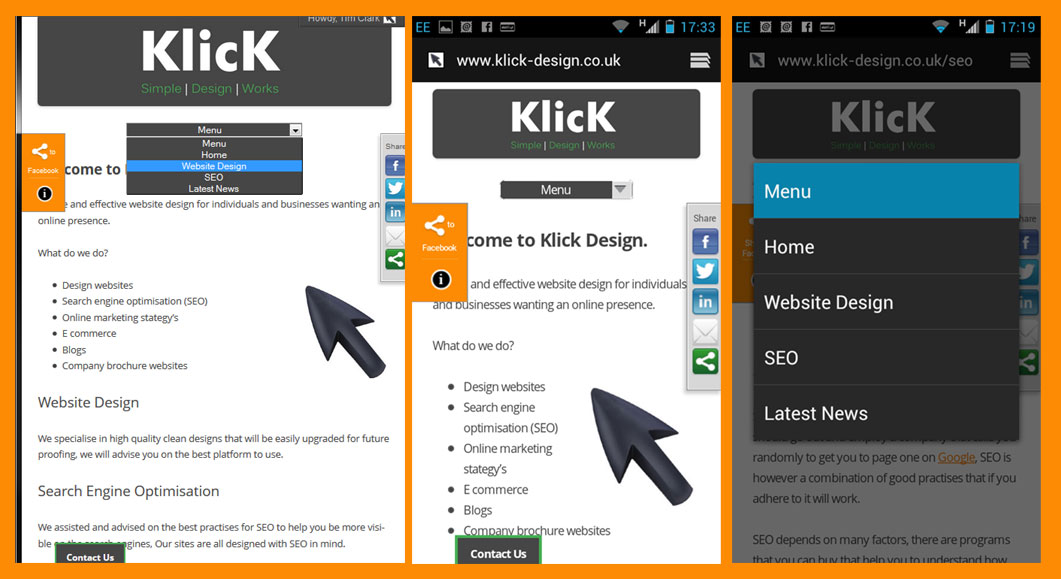
Click To Enlarge
This menu is used on Klick Design test it out first on your device.
I have assumed that you have created a child theme for Twenty Twelve if you have not then read this first.
Right lets start to change the menu, first you need to create a new custom menu.

Click to Enlarge
Navigate in your dashboard to Appearance>Menus and create a new menu.
Name the menu ‘Klick’, add the pages you want to the menu save the menu and select it as your primary menu.
For the next bits you can download the zip at the bottom of this page.
First open the add-to-styles.css file copy the code into the bottom of your child styles.css’
Next create a folder called js in your child theme and upload the klick-nav.min.js to that folder. I have minified the js for you to load nice and fast.
If you ever need to minfy a .js file then I use this tool it is free an just does it in a browser window.
Add the code from the add-to-functions.php into your child functions.php or simply rename the add-to-functions.php to functions.php and upload this to the child theme.
What’s left well it should be working for you now, You have your improved responsive menu twenty twelve so next to style it to match your theme colors.
|
1 2 3 |
.selectnav { display: none; width:50%; } select.selectnav {margin:0 auto; background-color:#464646; color:#ffffff; text-align: center; } |
In the above css you can change the width, background color and color of the text, I am sure some of you will get fancy.

Posts You Might Also Like...


Massive Thank you !! Works Great on twenty eleven as well.
Great, has saved me loads of time and installed in minutes.
PLEASE tell me which plugin you used for your Twitter Tweets in your side bar, I have looked and can not find what you have used……
Thank you… S
Sorry it’s not a plugin, it is done in jQuery.
If I do it as a plugin I will email a copy, if not I will write an article on howto.
Hi,
thanks so much on creating and sharing this tutorial.
I am wondering if there is a possibility to style dropdown menu items further? I mean, in my case, I have two-level menu. When I click on a menu dropdown, it opens like a list. Currently, the only distinction between menu items is that sub items have dash in front of them. Is it possible to style that dropdown list in a way that first level items are written in a bigger font, different color or is it possible to indent subitems a little?
More precise, is there a separate selector that could be used for subitems?
Hi Glad you liked it, yes you can style pretty much as you want, you can change the dash to another seperator like >, /, | what ever you want in the minified .js file at the end of all the script you will see “indent: ‘-‘” the – is what to change, as regards to styling the menu on the dropdown list that can be achieved as it uses different id selectors, if you add a second level then use firebug to inspect it you will see.
Thanks!
hi Tim, many many thanks for the solution!
i’m too trying to style children options differently, but i can’t see any “different id selectors” in the output:
Menu
Menu 1
Menu 2
Child 1 Menu 2
Child 2 Menu 2
Menu 3
i managed to add a class name to the options in klick-nav.min.js:
html+=''+prefix+text+'';
is there a way to add a second class “child” if the option has a parent?
I have no words for you. You just made my day! Thank you very very much!
My pleasure! Always nice to get feedback.
Thank you so much for this!!
It worked perfectly and saved me so much time. You can see it in action on my site if you want.
I still have to style it a bit, but I love it!!
Very nice work. I’m a fan.
Cheers Todd
Hello, I did this and I got the drop down menus – I am working locally now. But the menus are till there above the drop down menu…
any comments on how to remove them – that is what makes the site looks really bad…
Thanks!
Hi Madeleine, Have a look at what your menu is called in your source, and make sure that you @media queries in you css have display: none; for the screen size, Difficult to debug exactly for you as a local site, do feel free to contact me as soon as it is live if you can’t sort yourself and I will let you know how to deal with it straight away.
Tim
late bit not to late … i found that genius idea to improve the poor one original menue of 2012! and it does work best.
but when i look on the second screenshot above, there are 3 different styles to be seen – so i prompt had the idea i like to have the 3. style for ma site. but how, just by changing css? i would appreciate so heavy the one golden tipp for that
thanks a lot!
Hi, If you want that style all the time and not the original menu then you can do that by altering your style.css, I can’t remember off the top of my head exactly where as I am not using Twenty Twelve any more, but what you need to look for the
and move it above the @media queries, then use the
higher up the style sheet, If you add the menu to your site and the use the contact form email me a link to it and I will tell you what to alter and how.
Tim
Hi, this is the first tutorial that has worked (almost) for me – so glad. Thank you so much for putting it out there. I am building a new twenty twelve themed site. However, I am having the same issue as Madeleine. The regular nav does not disappear at 600px wide. It just stays the whole time above the new dropdown menu. I looked at the selector for the menu and have tried a number of different ways to get it to display:none in the @media query, but just cannot get it to work. I am not sure what I am missing? Also, I cannot figure out how to style the dropdown. at 960px it is tiny and I cannot figure out how to make it larger. Any suggestions you could provide would be greatly appreciated?
Hi Rob, In your child theme Style sheet you have on line 196 display: inline-block !important; try removing the !important, If that does not work then add in display:none!important; into the @ media query resolution where you want to hide the default Twenty Twelve Menu.
The menu width can be dealt with by using css like
#selectnav1 {width: 20%;
}
If you need more help just let me know.
Tim